The exhibition focuses on nine themes illustrating graphic design’s different fields of application : The performing arts and particularly the theatre, both forcing graphic designers to reflect on narration, dance and contemporary art with their more conceptual codes, and also music and fashion, self-production, books, typography and visual identity. These typologies show the evolution of a discipline and profession, its clients and mediums.
The exhibition begins with a tribute to the late Frédéric Teschner.
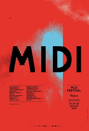
Frédéric Teschner, Midi Festival 2010, 2010
Affiche
© MAD, Paris / Jean Tholance
Teschner regarded his work as a space for encounters and collaborations with institutions, small structures and artists. He saw his role in this as a translator or intermediary between the client and the public. Frédéric Teschner forged a graphic vocabulary and an innovative stylistic palette directly in gear with the Internet “revolution” experienced by his generation. He was less interested in the tool than in what it can do to renew our relationship with the image, in terms of its dissemination, hierarchical organisation, use and even deterioration. He made the enlarged pixel the basis of his graphic language, exaggerating its size to make it a pictorial element.
By taking one commission as an example of each designer’s work, the exhibition shows the richness and diversity of graphic design today (posters, flyers, brochures, stationery, objects, books and disc sleeves), emphasising its cultural, intellectual and aesthetic challenges in a world invaded by images and signs.
These presentations include:
• M/M (Pari)s for the Théâtre de Lorient (1996 to 2015)
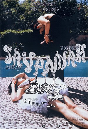
M/M (Paris), Savannah Bay, CDDB-Théâtre de Lorient, 2002
Affiche
© MAD, Paris / Laurent Sully Jaulmes
For each poster, these two graphic designers adapted the rules of classical tragedy: unity of time, place and action. Each poster is constructed around a colour photograph and a high-contrast black and white title. The image, apparently a documentary picture of everyday life, was chosen after attentive reading of the play and conversations with the theatre’s director, Eric Vignier.
• Anette Lenz for Le Phare - Centre chorégraphique National du Havre (since 2011)
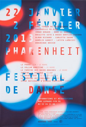
Anette Lenz, Pharenheit Festival de danse, Le Phare-Centre chorégraphique du Havre, 2012
Affiche
© MAD, Paris / Jean Tholance
To conceive Le Phare’s visual identity, Anette Lenz took the centre’s name and its mission to promote culture as her starting points. The centre’s communication documents transpose two elements, light and radiance, using luminously coloured halos like beams to illuminate the name of the centre and the event.
• Pierre Di Sciullo and the review Qui ? Résiste, (since 1983)
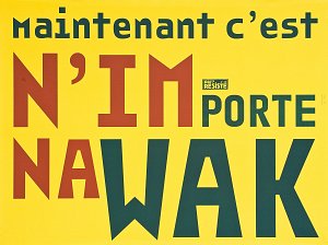
Pierre di Sciullo, Qui? Résiste n° 12, 2008
Affiche
© MAD, Paris / Jean Tholance
For the twelfth number, Pierre Di Sciullo produced the N’importenawak series of twelve posters on the theme of “joyful nonsense.” “These posters,” he says, “are a typographic bonfire of vanities and adverts, a poetic hymn to the poster in the street. They incite us to realise the ambivalence of words, the duplicity of slogans and the act of reading at an inopportune moment.”
• Les Graphiquants for Stéphane Kélian (2017)
Commissioned by the shoe brand to redesign its visual identity, les Graphiquants remained faithful to their principle of combining graphic signs and typographic experimentation, playing on geometric abstraction and poetry and making full use of colour to punctuate their vocabulary, notably with photography. “With the warmth of luminous colours, we wanted to give a more abstract, pictorial dimension to the rigorous architectural lines and androgynous minimalism dear to the brand.”
• Julie Rousset for L’Impossible, L’autre journal (2012)
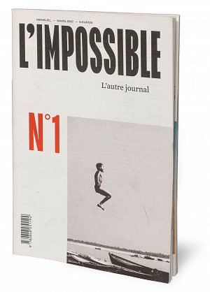
Julie Rousset, L’Impossible. L’autre journal n° 1, 2012
Journal
© MAD, Paris / Jean Tholance
In response to the newspaper’s multiplicity of writers and points of view, Julie Rousset created a “sensation of overflowing” with a page layout doing away with margins, jumbled, framed and reframed content and displaced imagery to convey the idea of proliferation, even hubbub.
• Cléo Charuet for Monoprix (since 2010)
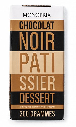
Cléo Charuet, Monoprix, 2011
Packaging
© MAD, Paris / Jean Tholance
Cléo Charuet’s idea for redesigning Monoprix’s product packaging was simple: breaking imposed rules by exploiting the obligatory text on packaging as a graphic element in its own right. She decided to no longer privilege imagery on packaging since other brands already provide this visual information on the shelves, and to use new complementary and dissonant colour codes to distinguish them. Typography and colour thus become the only key brand signs for some two thousand products ranging from food, hygiene and beauty to home and interior decoration.
• Vier5 for the Centre d’Art Contemporain de Brétigny-sur-Orge (since 2002)
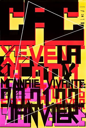
Vier5, Rien du tout.X Event, CAC de Bretigny, 2006
Affiche
© MAD, Paris / Jean Tholance
Vier5’s particular conception of their work presupposes full commitment on the client’s part. Pierre Bal-Blanc, director of the CAC Brétigny, regards the work of graphic designers as an integral part of the centre’s artistic programme. He allows them complete freedom to periodically reinvent the centre’s visual identity. The logo is constantly renewed in function of the project and the artists exhibiting, so that each event has its own graphic language. Thus each graphic object is a specific response, a singular combination of signs adapted to the client, and because these responses are also motivated by cultural, social and urban considerations, all the projects shown in the exhibition are accompanied by texts giving a fuller understanding of the designer’s artistic response.